This page explores relationships between the air quality in major cities to other data including population, life expectancy, etc.
Original Dataset
Below is the dataset used for this analysis:
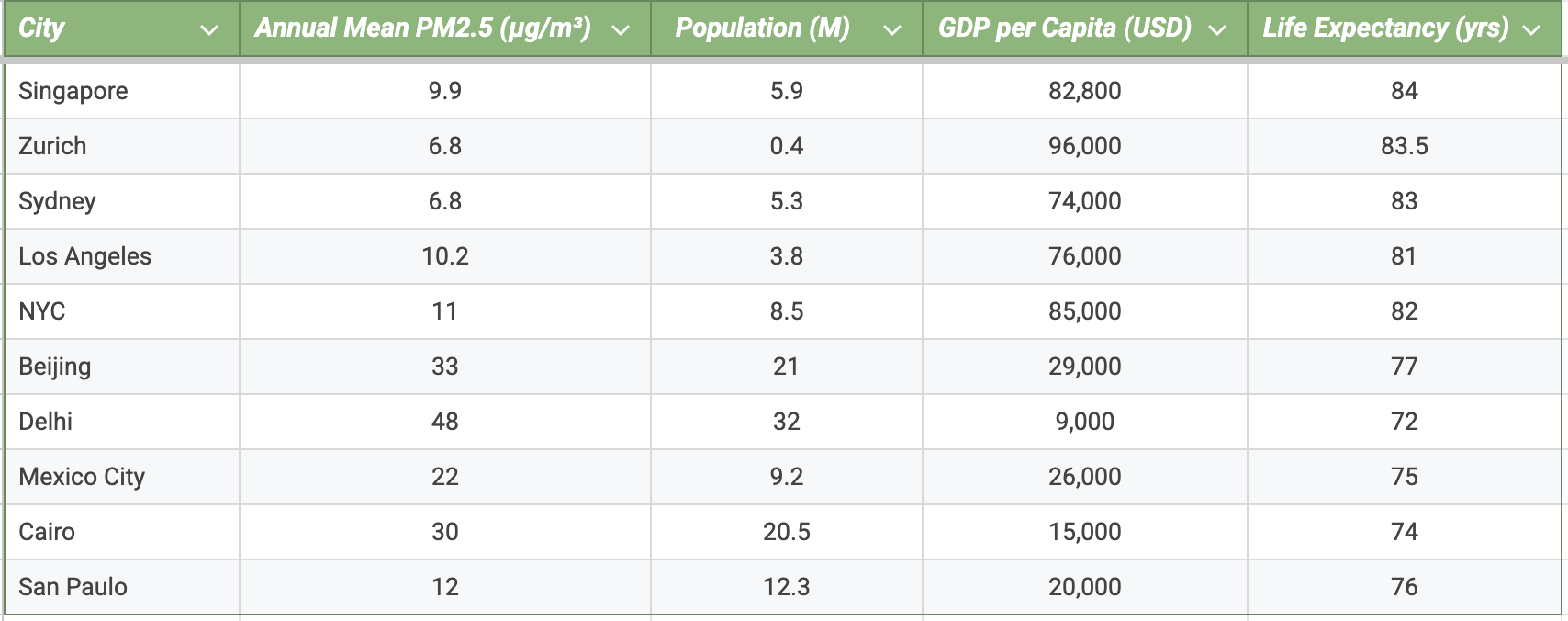
Chart 1: PM2.5 Levels vs. GDP Per Capita
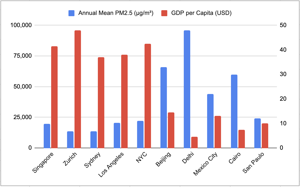
The cities that have higher GDP per capita have lower PM2.5 levels, suggesting that the wealthier cities may have stronger environmental policies or cleaner energy infrastructures.
Chart 2: PM2.5 Levels vs. Life Expectancy
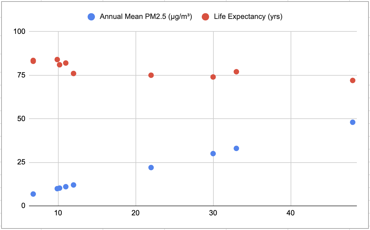
This chart highlights a conclusion that is a bit intuitive: there is an inverse relationship between air pollution and life expectancy, cities with higher PM2.5 levels typically have lower life expectancy.
Chart 3: PM2.5 Levels vs. Population
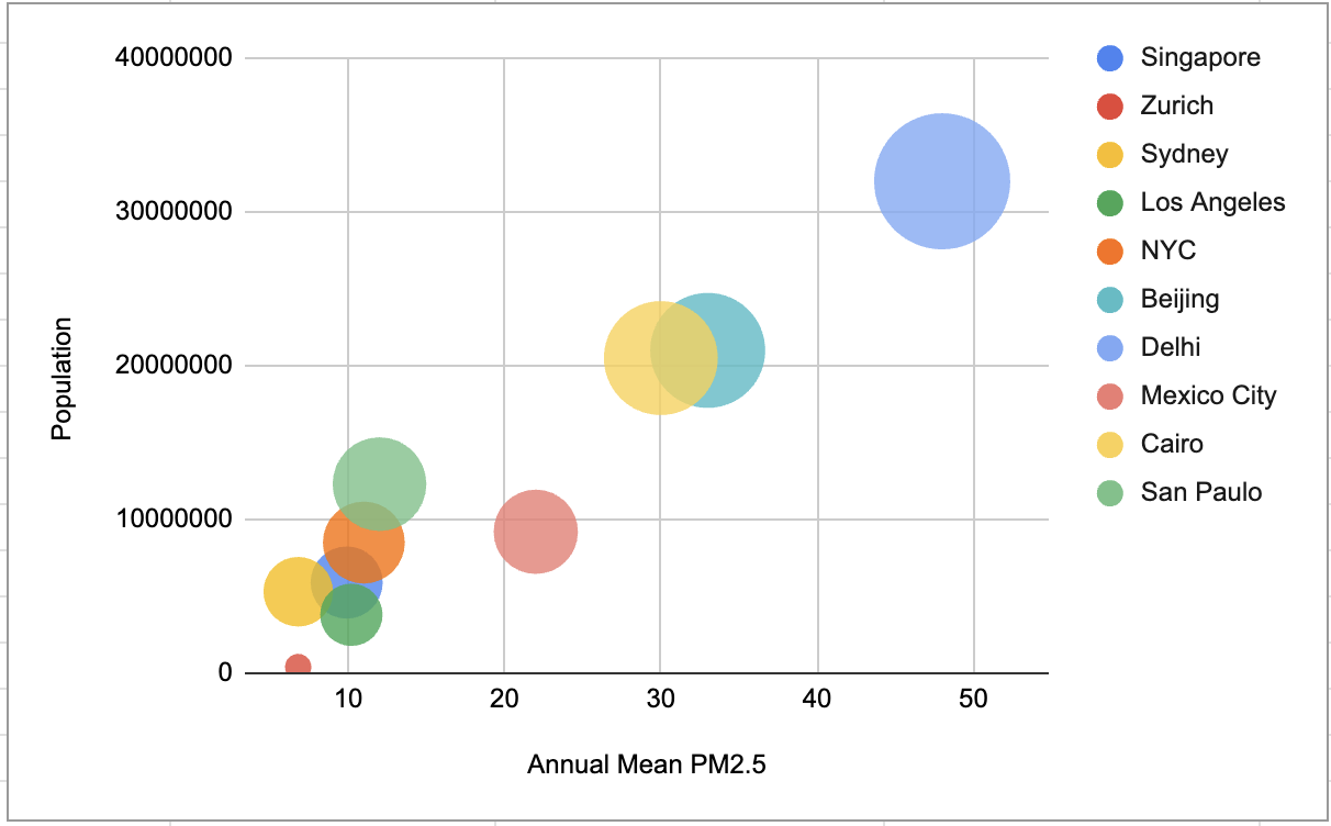
High-population cities often experience higher PM2.5, highlighting the link between urbanization and pollution.